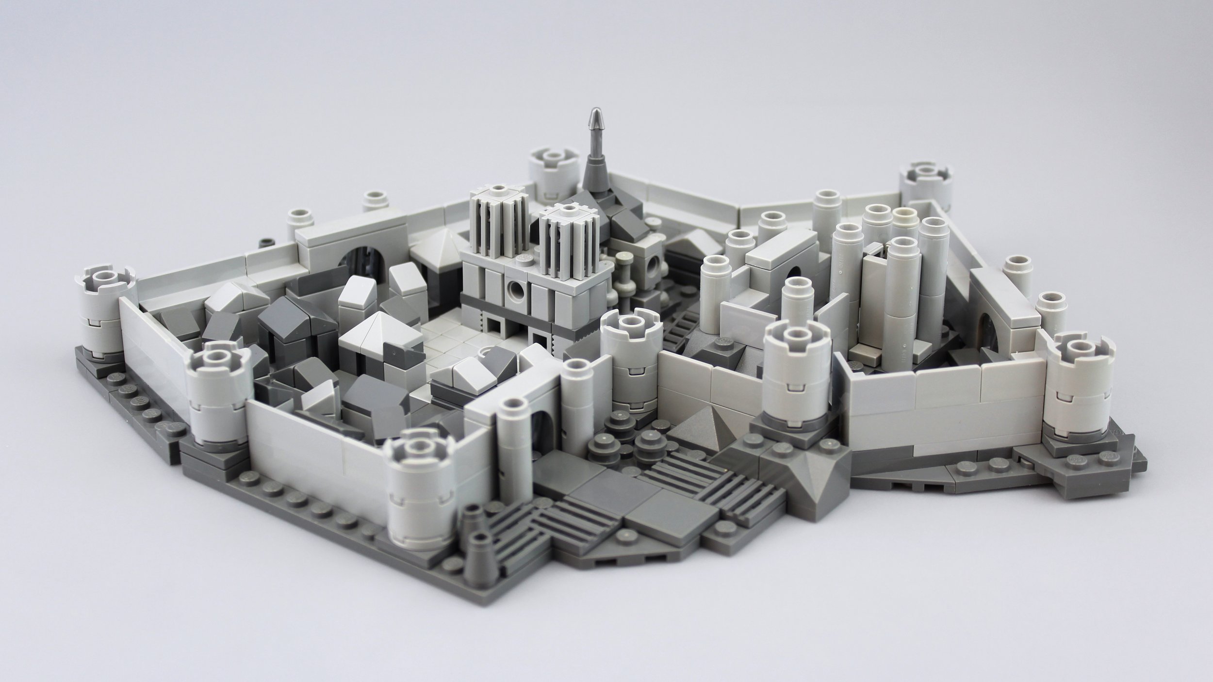
I built this model as a trophy for the 2019 Summer Joust, a medieval-themed building contest. As one of the competition’s judges, I was asked to prepare a prize for the “No Bley” subcategory. Entries in that category weren’t allowed to use any “bley”—a portmanteau of “bluish grey,” shorthand used to refer to LEGO’s post-2004 gray hues— so I thought it would be fun and tongue-in-cheek if the entire prize I designed was built from those colors!
Inspiration and References
Seaside Castle, a build of mine from 2018
I decided to assemble this medieval European castle town, a small walled city complete with a cathedral, market street, open-air plaza, and fortified keep. I was inspired in this subject matter by Jonas Kramm’s Game of Thrones micro-castles, the fabulous micro-cities and castles of Jeff Friesen, and my own prior foray into micro-castle building, the Seaside Castle. As you can see, I reused the wall technique I first employed on that last build again here. I love how the upside-down 2x2 round bricks and the short panels together create a sense of contiguous ramparts.
I’d highlight three major differences between the Seaside Castle and this model. Firstly (obviously) this model is built in just two colors, rather than in a fully saturated palate, giving it more of a “graphite” quality I’m actually quite pleased with. Secondly, while Seaside Castle was built along rectilinear lines, this model’s base employs hinge plates and wedge plates to creating a complex footprint, laying the foundation for an unorthodox castle that contours organically to its terrain. Lastly, this castle town contains a fully-realized micro-cathedral!
The cathedral is my favorite part of the build, definitely. I have a real weakness for Gothic architecture and so couldn’t resist the opportunity to return to that realm in this build. The fictitious cathedral you see here is loosely based on Notre Dame de Paris, one of the world’s most famous historical buildings. For details, shapes, and composition, I’ve drawn a lot from David Macaulay’s brilliantly illustrated architectural books, Castle and Cathedral. I trace the inner/outer curtain structure of this city, as well as the shape of its gatehouses and towers, to Castle.
I built and photographed this entire creation in just one day. I like to think that the speed with which I designed meant that I’ve ended up with an authentic “sketch model.” That’s not to say that the creation you see here is unfinished; I more mean that there’s a certain one-off energy that has been preserved in this build. I hope that its eventual recipient will feel and appreciate this unstructured creative energy.
Design Choices
Here’s that cathedral. Its signature, Notre Dame-esque towers were the first parts of the build I assembled. I originally toyed with the idea of making just a cathedral— but once I’d nailed these towers in such a small size, I recognized that I’d need to build something a little more substantial as a prize, and opted to just build the whole city.
I like the little well I’ve put in the town square. A clean and protected water source is critical for any castle when it’s under siege!
One of my proudest part usages on this build is my employment of taps as flying buttresses. They’re petite elements which give a good “bang for my buck” at this microscale size. Plus, I was able to easily array them in a rounded shape to give a feel for the back of the cathedral.
Outer walls are all well and good, but I was determined to include a second, more fortified curtain of defenses in this castle. Atop a rocky outcropping sits the lord’s keep, his citadel, which overlooks all the rest of the castle.
For me, the keep is a bit of a mixed bag. I like how it looks in person, but it proved tough to photograph. I think a lot of its depth gets lost as it starts to blend with the outer curtain behind it. The only pitfall of building in monochrome!
Another bit I’m especially proud of: these cute little portcullises! All three of the city’s gates, and the gate to the keep, are barred using silver 1x2 grille tiles. While 95% of the model is built in light and dark bley, I included just a few hints of silver on these gates and the spire of the cathedral. The color is similar enough that it doesn’t detract from the greyscale illusion.
You may also notice some tilled farmland outside this gate, which uses that same grille piece in a different way.
Here’s a closer look at the market street and town. I did my best to create a sense of liveliness and barely-controlled chaos in this part of the build. I wanted to create distinction between the clean lines of the keep and cathedral—structures of the powerful—and the crowded sprawl of those forced by feudalism to serve.
I wish I’d had some 1x1 double slopes in grey for some of the smaller buildings’ roofs, but this is still a part outside of my inventory in that color.
Thanks for reading! If you have any other questions or thoughts about this model, feel free to leave them in the comments below.

